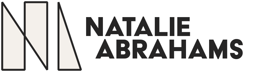
This is the final logo but it took quite some time to land here. Let's back up to the beginning to see the process.
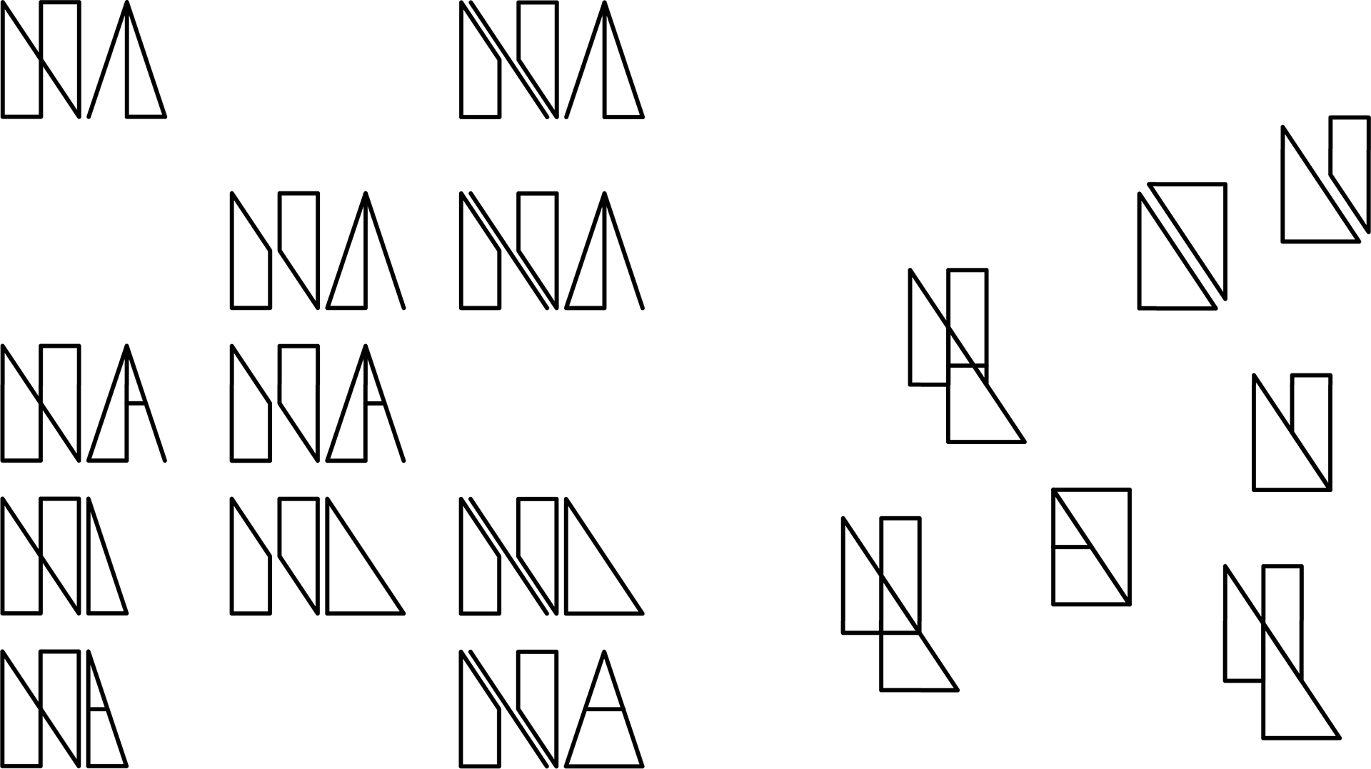
I knew from the beginning I wanted a minimalist logo with an architectural structure. This was a logo for my personal brand to be used on my resume, business cards and website so I knew it had to be a strong representation of who I am as a designer. I first created a few geometric shapes using the grid that represented my initials.
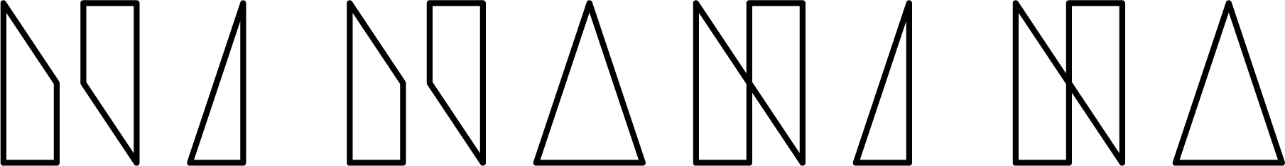
I then expanded on my idea, re-working the shapes over and over and with different pairings to get an idea of all the possibilities that I could create in this style.

My next course of action was to sort them and give each logo iteration room to breath. I was able to pick out which ones I liked and disliked more easily and see them each as their own separate idea.

Even though I was narrowing down my designs I still kept thinking of new ways the logo could possibly change.
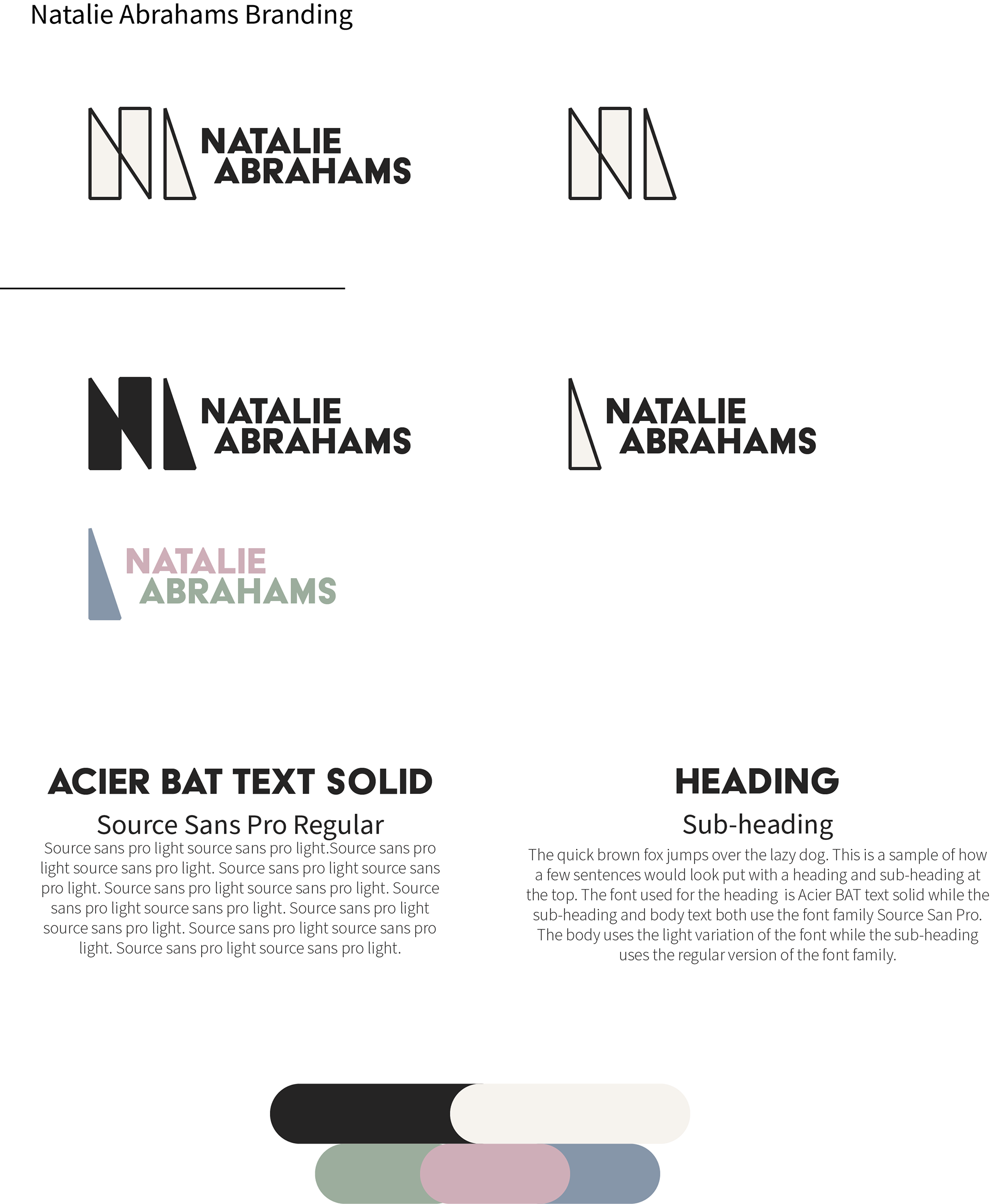
This was the final branding sheet displaying the logo, typefaces, and color palette that will be used to display my personal brand. While there is one main logo it can be converted for slightly different uses.